Plotting Ungrouped Scalars
Here there are the classes that plot ungrouped scalars
-
class
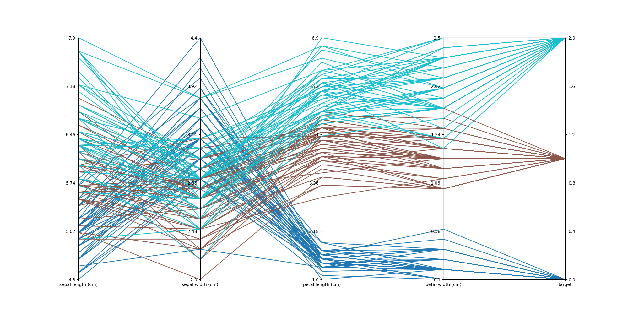
plotszoo.scalars.ScalarsParallelCoordinates(data, groups, target)¶ Plot a parallel coordinates plot with respect to
groupsand usingtargetas rightmost field- Args:
- data
plotszoo.data.DataCollectionwith some scalars- groups
columns of
datascalars to plot the data against- target
column of
data, plotted rightmost and used to color the plot
Example:
import numpy as np
import pandas as pd
import os
import matplotlib.pyplot as plt
from sklearn.datasets import load_iris
import plotszoo


iris = load_iris()
scalars = pd.DataFrame(data= np.c_[iris["data"], iris["target"]], columns=iris["feature_names"] + ["target"])

data = plotszoo.data.DataCollection()
data.set_scalars(scalars)

fig, axes = plt.subplots(1, len(iris["feature_names"]), sharey=False)

parallel_plot = plotszoo.scalars.ScalarsParallelCoordinates(data, iris["feature_names"], "target")

parallel_plot.plot(axes, cmap="tab10")

fig.set_size_inches(20, 10)
fig.savefig(os.path.join(os.path.dirname(os.path.realpath(__file__)), "images/ScalarsParallelCoordinates.png"))
-
plot(axes, ticks=6, adjust_whitespaces=True, cmap='Blues', cmap_fn=None, xticks_fn=None, colorbar=False)¶ Plot the parallel coordinates chart
- Args:
- axes
List of
matplotlibaxes to plot to (you must use the same number of axes and groups)- ticks
Ticks configuration dictionary or number of ticks to show in the axes (Default: 6)
- cmap
matplotlibcolormap to use (Default:Blues)- colorbar
Plot the colorbar (Default:
False)- cmap_fn
Function to use instead of the
matplotlibcolormap (Default:None)- xticks_fn
Function to create the xticks (Default:
None)- adjust_withspaces
Call
plt.subplots_adjust(wspace=0)to make the plot prettier (can have side-effects) (Default:True)
Configuration Dictionary:
- A dictionary with a key for each
group. Each element is a dictionary with: - type
categoricalornumeral- ticks
Number of ticks if type is
numeral, the list of ticks in the type iscategorical- scale
The scale to use
linearorlogarithmicif type isnumeral,relativeorsequentialif the type iscategorical
Configuration Dictionary Example:
{
    "config/train_steps": dict(type="categorical", ticks=[8, 16, 32, 64], scale="relative"),
    "config/gamma": dict(type="categorical", ticks=[0.9, 0.99, 0.999], scale="sequential"),
    "config/lr": dict(type="numeral", ticks=6, scale="logarithmic"),
    "config/max_clip_norm": dict(type="numeral", ticks=6, scale="linear"),
    "config/ent_coef": dict(type="numeral", ticks=6, scale="logarithmic"),
    "config/vf_coef": dict(type="numeral", ticks=6, scale="linear"),
    "config/target_entropy": dict(type="numeral", ticks=6, scale="linear"),
    "summary/reward": dict(type="numeral", ticks=6, scale="linear")
}
-
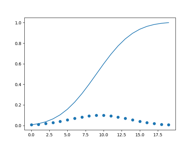
class
plotszoo.scalars.ScalarsScatterCumulative(data, x, y, cumulative_fn=<function amax>)¶ Plot a scatterplot with some running cumulative function (ex. maximum, minimum, mean, sum, …)
- Args:
- data
plotszoo.data.DataCollectionwith some scalars- x
Index to use as x in the scatter plot (set to
Noneto use theDataFrameindex)- y
Index to use as y in the scatter plot (required)
- cumulative_fn
Cumulative function to use (Default:
np.max)
Example:
import numpy as np
import pandas as pd
from scipy.stats import norm
import os
import matplotlib.pyplot as plt
import plotszoo

x = np.linspace(norm.ppf(0.01), norm.ppf(0.99), 20)
pdf = pd.DataFrame(norm.pdf(x)/norm.pdf(x).sum(), columns=["pdf"])

data = plotszoo.data.DataCollection()
data.set_scalars(pdf)

fig, ax = plt.subplots()

scatter_cumulative = plotszoo.scalars.ScalarsScatterCumulative(data, x=None, y="pdf", cumulative_fn=np.sum)

scatter_cumulative.plot(ax)

fig.savefig(os.path.join(os.path.dirname(os.path.realpath(__file__)), "images/ScalarsScatterCumulative.png"))
-
plot(ax, sort=False, scatter=True, label=None, x_seq=False)¶ Plot the cumulative scatter plot
- Args:
- ax
matplotlibax to plot to- sort
Sort the x data (Default:
False)- scatter
Scatter-plot the data points (Default:
True)- label
Label to use to plot (Default:
None)- x_seq
Use an integer sequence as x instead of the actual values (Default:
False)